With mobile devices accounting for more than half of online traffic, it has become crucial for websites to adapt to a mobile-first approach. Responsive web design has emerged as a popular concept that enables websites to adapt to the user’s device, screen size, and orientation. Unlike mobile-specific designs, responsive web design uses a single codebase to adjust to different screen sizes, thereby enhancing the user experience across all devices. In this blog, we will explore what responsive web design is and why it’s crucial for website designers to implement mobile-first designs.
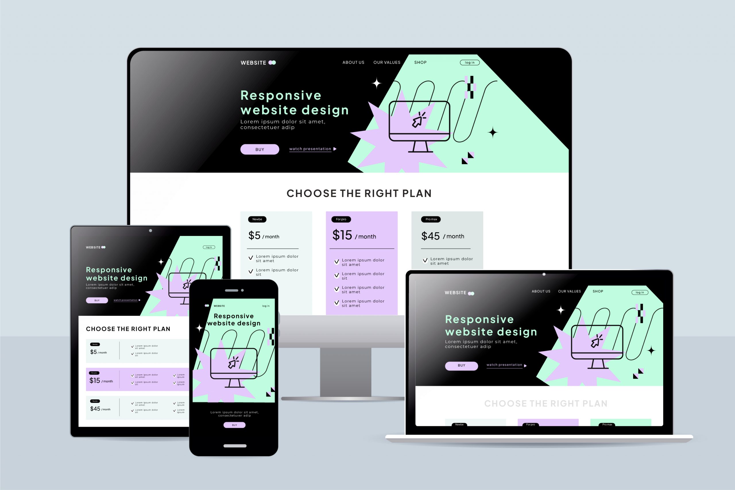
As the name suggests, responsive web design enables websites to respond to their environment, meaning the website adjusts itself depending on the viewing device. Responsive web design uses a single codebase, in which the website’s elements proportionally adjust to different screen sizes. For instance, if the site is viewed on a mobile device, there is no need for horizontal scrolling as the site resizes itself to fit the screen size.
With mobile devices emerging as the primary source of browsing the internet, responsive web design has become essential for websites worldwide. Responsive web design allows developers to create a website that adapts to any device size. By doing so, it improves the viewing experience for users and boosts website traffic across all platforms. In addition, responsive web design also makes it easier for website owners to manage their online presence as there’s no need to create different versions of the website for different devices.
As a website designer, it is crucial to follow best practices when developing a responsive website. For instance, designing for mobile-first ensures that the website’s design and layout are optimal for smaller screens. Also, it’s important to use readable fonts, maintain a balance between text and images, and ensure that navigation elements are easily accessible. Moreover, optimization of images and videos is critical as loading large-sized files can slow down the website’s speed, leading to a poor user experience.
AMP is an open-source initiative used to optimize mobile pages’ performance by reducing page load time. AMP improves a website’s mobile experience by streamlining website code to remove unnecessary elements that impact page speed. With the growing importance of mobile-first design, adopting AMP is becoming a crucial element for developing responsive websites. AMP is supported by search engines like Google, helping websites generate better traffic and search engine rankings.
As technology continues to advance, responsive web design will continue to evolve to account for new devices and emerging technologies. Since the mobile-first approach is not going anywhere anytime soon, responsive web design will remain a fundamental element in web design. Additionally, with the increased emphasis on creating a positive user experience, we can expect responsive web design to focus more on personalized, context-driven user experiences.
With the increased use of mobile devices worldwide, adopting a mobile-first approach to web design has become crucial. Responsive web design has emerged as an essential strategy that enables websites to adapt to different screen sizes, enhancing the user experience across all devices. As a website designer, following best practices for responsive web design, such as designing for mobile-first and using readable fonts, is crucial. The growing importance of AMP and the need for personalized user experiences indicates that responsive web design will continue to evolve. In conclusion, responsive web design is a vital aspect of web design that website designers must keep in mind to achieve optimal user experiences.